THE ART OF BALANCE – MAKE-UP PRO LAN NGUYEN-GREALIS ON WORKING ON HAIR SHOOTS
From minimal to otherworldly, these are the top 10 make-up looks from Lan’s hair shoot career – as selected by her.
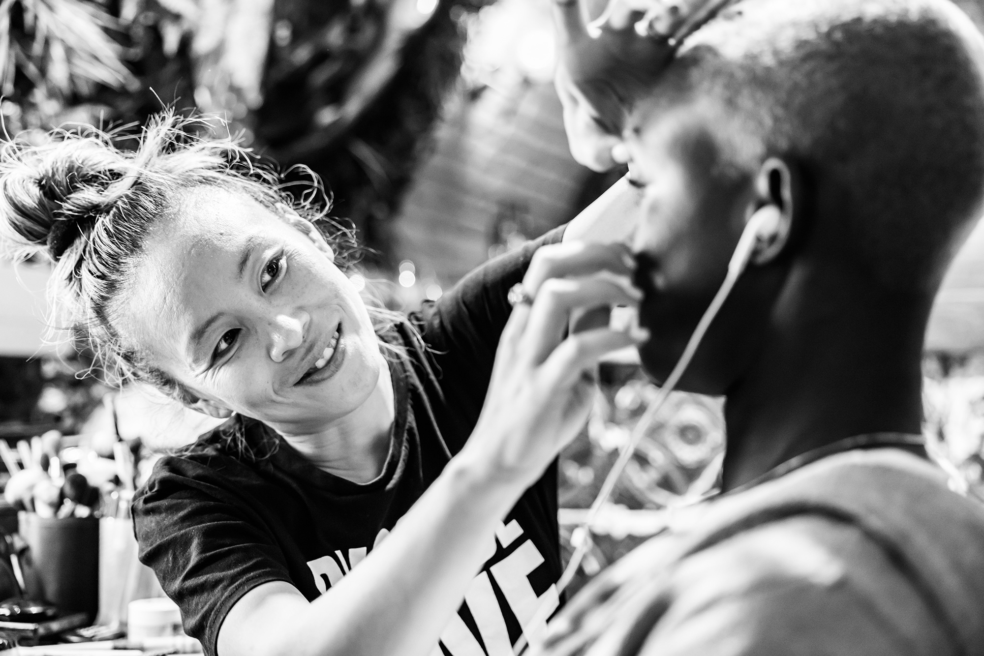
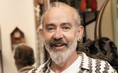
Lan Nguyen-Grealis working at Creative HEAD cover shoot
An iconic MUA in the world of hair photography, Lan Nguyen-Grealis is the go-to beauty perfector for so many top name hairstylists, working on collections that have won multiple awards and featured on lots of magazine covers. Outside of hair, her client list name checks Burberry, Dior, Vanity Fair, Glamour and celebrities including Raye and Paloma Faith. She’s even authored two books – Art and Make-Up and ProMakeup Design Book. We set her a challenge – to select the top 10 make-up looks she’s created on hair shoots, while explaining how she approaches a shoot where the hair is the star…
How much of your work would you say is made up of hair-led shoots?
Most are hair led. When I collaborate for me it’s all about bringing the best into the model to help sit in the world of the theme that the hair wants to bring. I love bringing characters to life so it’s all about the feeling.
How do you approach a hair-led shoot differently to a fashion/make-up shoot?
The hair shoot requires me to really hone my skills for understanding face structure and how the hair affects the face. I have to really be quick and think on my feet as sometimes it doesn’t work and I have to be able to add or take away to help the look. There is an element of balance to the overall image that is required and to figure out if the make-up is adding or distracting. If it’s creative it still needs to be considered with hair balance.
When it comes to a fashion or make-up shoot, it’s all about moodboard and referencing to add to the theme. I come up with various concepts to give a directional make-up look. It’s experimental and strong and always open to push boundaries so requires lots of research and play with products colours and basically sometimes anything goes from bodypainting, SFX, making and customisation.
What’s the biggest lesson you’ve learnt from hair shoots when it comes to doing the make-up?
My biggest lesson has definitely been ‘less is more’, because it’s all about creating a collection that fits the hair than make-up. Sometimes when the make-up is strong it can date the look or overpower the image.
What advice would you have for any hairdressers reading this about approaching make-up concepts/ideas on their shoots?
I think it’s important for hairdressers to really consider the models first, not just about the hair but the looks because make-up has to follow. If the make-up is strong, you really need a good canvas to carry off the looks. And definitely think about the theme. What world do they see their models in. It’s important to be flexible with make-up as clothes and lighting are just as important. When it comes to the image especially in hair shoots your restricted more because the way it’s shot to showcase the hair.
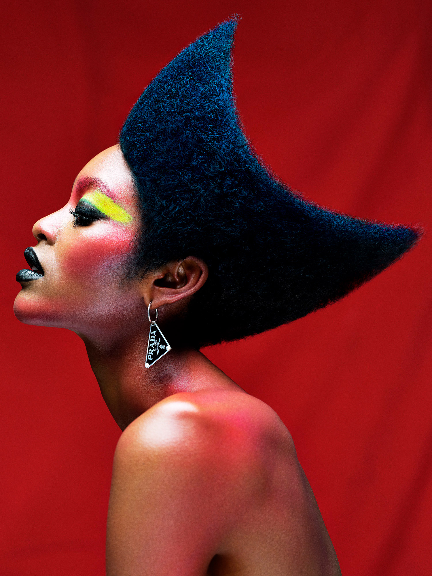
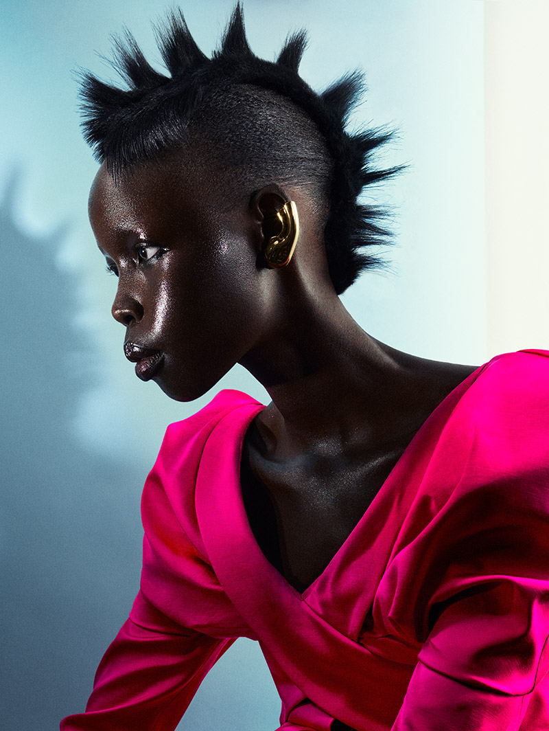
Hair: Errol Douglas MBE, Errol Douglas. Photography: Richards Miles. Fashion styling: Leticia Dare
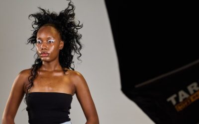
Based around the ’80s and colour clashing, this image is striking because of the contrast between the hair and make-up. I loved using the acid green and yellow tones to pop against the model’s skin tone. An homage to Grace Jones, the colours were carefully placed to bounce off each other. I also used the reds and black to create shades of darkness and colour such as blue and brights to lift and highlight.
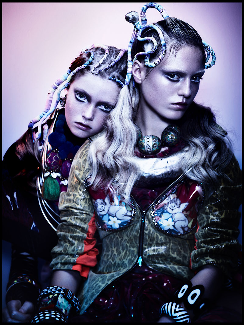
Hair: Sally Brooks, Brooks & Brooks. Photography: Jenny Hands
This particular collection was fun to work on because all the models had characters. I loved this duo set because it was playful and the clothing to the hair was graphic. The make-up needed to follow in contrast as they had beautiful soft features. I played with their eye shape to give a strong dramatic lines and shade that opened the eyes and made them look alike. Using tonal skin colours like brown to black and white, it allowed the light to play with the shadow.
Hair: Cos Sakkas, Toni&Guy. Photography: Jack Eames.
Fashion styling: Borna Prikaski.
This look was purely about skin. The raw, polished shine that bounced in the light helped bring a beautiful dimension to the look. I used oils, balms and mixed-in highlighters to accentuate the features of the model. I created a beautiful glow that was shimmering and reflective, then kept it wet by spraying the model with a pre-mix shine and shimmering formula all over and throughout the shoot.
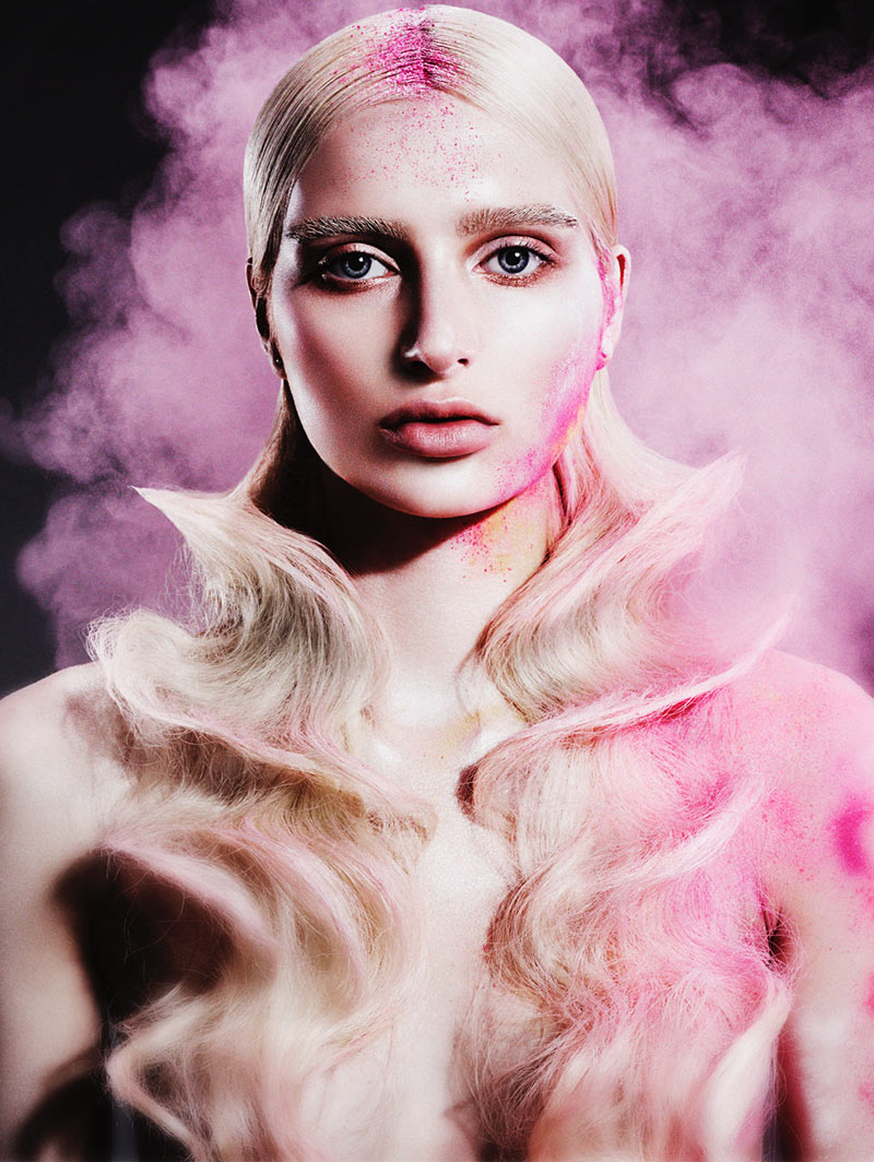
Hair: Gary Ingham, Gary Ingham salons. Photography: John Rawson.
A challenging shoot that required lots of prep work, but it was so much fun. First I took away the models’ brows and toned her skin to be like a blank canvas. I ensured I used skin tone nudes and peaches to warm up the sockets and open up the eyes to allow her beauty to shine through. There was still the usual contour and structure so when the light hits, the right places of the face lifted. Using loose powder pigments, I placed and blew the pigment on, carefully dusting with my brush into certain areas of the skin to focus on the bone areas. I was blowing onto the skin when the picture was being taken. It’s something that had to be carefully done otherwise it would have spread everywhere!
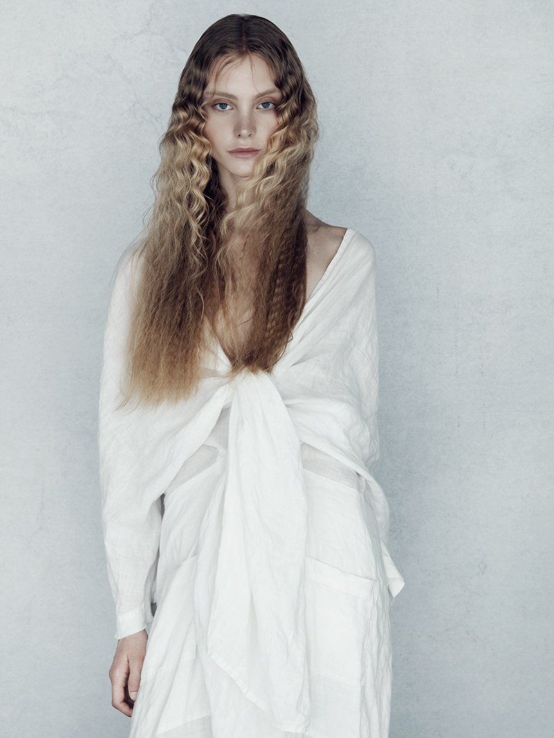
Hair: Sally Brooks, Brooks & Brooks. Photography: Jenny Hands
The simplicity of this shoot just says it all. The essence of ‘less is more’ was the brief here and only essential make-up required to allow each model to shine. Taking into consideration the camera and lights, usually I work backwards to see how the model photographs first and only filled in what I needed to elevate the models’ looks. To take it to that beautiful angelic soft realm, I ensured taupe and skin-like colours were used. So, just barely there on brows, lids, skin, and lips. This required a very considered and delicate touch and understanding of the feeling of beauty.
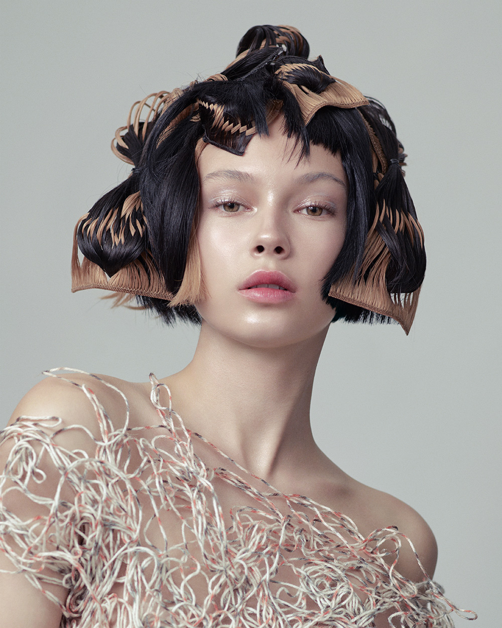
Hair: Sophie Springett and Hayley Bishop, Toni&Guy. Photography: Jack Eames.
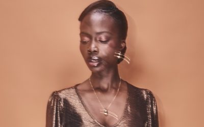
The theme for this look was elevated beauty with a feminine touch. Colours were real, soft and pure. I added a glossy lip soft cherry stain in the centre of the lip and blotted outwards to create a pout. Focus was on the lips so everything else on eyes and cheeks was just a highlighted sheen of metallic that gave a dewy finish. Where the hair was striking, we kept everything to a minimum. But lots of considered shine and highlights on the higher points of the face.
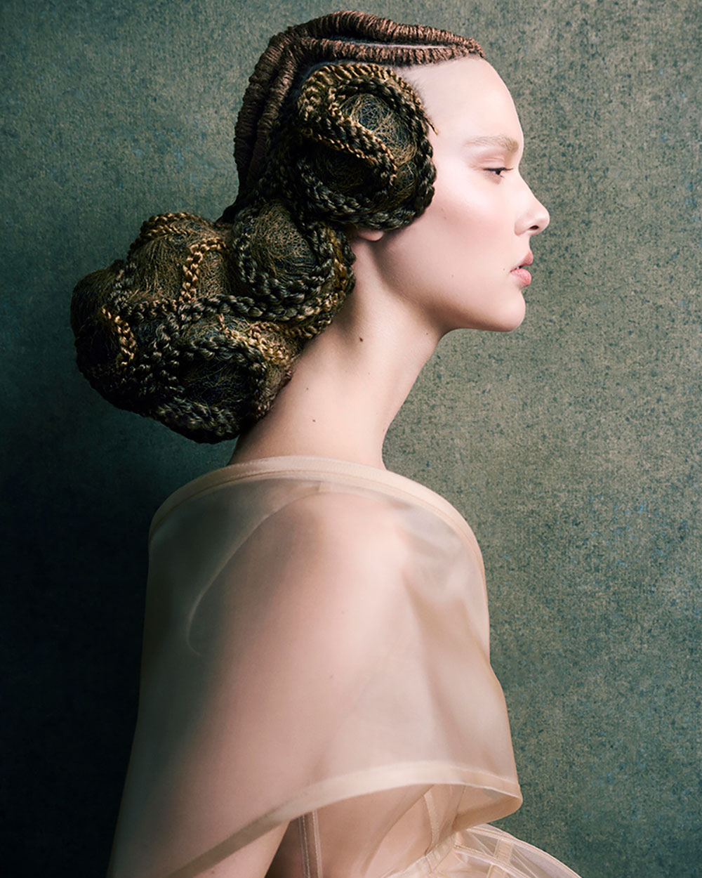
Hair: Efi Davies, Toni&Guy. Photography: David Mannah
Fashion styling: Borna Prikaski.
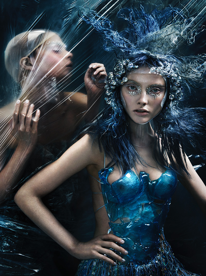
The make-up look required was an ethereal alien. I used face tape to stretch out the eyes and elongate the space for each model. This lifted into a higher wing and gave more space for sculpting and shading around the eyes. Colours are kept to cool tones that were matte and a clever placement of reflective balm sheen on higher point of the face to give a glass-like finish. Brows were paired back with bleach or concealer to keep it all tonal to the skin.
The important factor of this look for me was to ensure the colours I used were pretty and feminine. The overall look was so beautiful and with the directional clean lighting and background – everything looked earthy and effortless.
Hair: Silas Tsang. Photography by John Rawson.
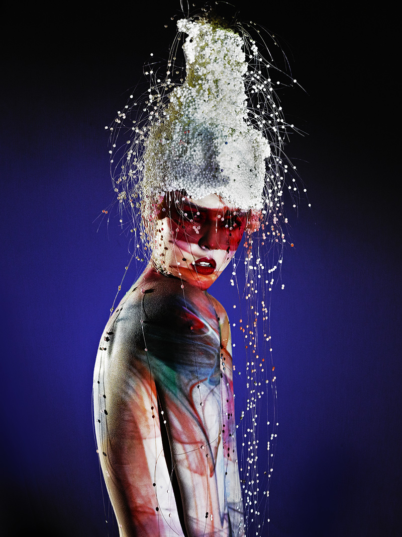
This shoot was based upon Futurism and projection. Lots of colour and interesting art shapes and colours were used instead of clothing. I had to work within each backdrop and decide on the paint strokes and colours, which then were painted all over the face and body to work with the model. There were many moving parts but it worked so cleverly to merge the model into a different world. That allowed the purest of hair to stand out with the lights and texture. This was so beautiful to watch being captured.
Hair: Indira Schauwecker, Toni&Guy. Photography: Andrew O’Toole
A very strong backdrop and direction for details, this look created a futuristic drama with textures and cool tones. Using crystals and various textured products and accessories, I placed these around the features to suit the look. As an extension to the hair, the make-up had to flow in the same way of the hair’s texture. There’s a mixture of contouring and play with the crystals in the highlight points of the models’ eyes and brows. I loved experimenting on this collection. Skin was soft with pink flushes and silver metallic washes.
Hair: David Barron, Barron Salon. Photography: John Rawson
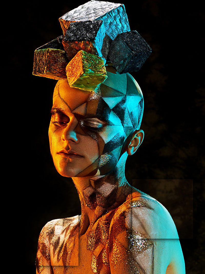
The make-up look here was based around illusion and dimensions. With the Cubist hair shapes, I gave the model a bald cap to take off any base hair for a smooth finish. Then I created a mock shape of cubes that contoured around the head and body to follow the flow of the hair. Using differently drawn sizes of cubes, I then shaded to give it all a 3D feel with light, medium and dark tones. Against the dark background and warm lighting, everything fused together.
Related
“Students Bring A Fresh Energy And Perspective”
Creative director Cyril Morgan on how his annual collaboration with Limerick fashion students fuels fresh creativity, blending nostalgia and innovation with artistry and future technology
Future Tense
Captivating hair artistry meets future tech – explore more from our Christmas cover shoot
Aminata: Redefining Textured Hair on the Global Stage
When Aminata Kamara took the stage at HAIR The Movement in Australia (14–16 September), she wasn’t just showcasing artistry, she was reframing the conversation around textured hair on one of the world’s most respected education platforms.
